
Week 6
This blog post is about discussing the overall design and accessibility for a chosen website in the GLAMR institute. I have selected the Campbelltown Library Website to explore. You can access their webpage via this link –https://www.campbelltown.sa.gov.au/library
The Campbelltown library website can be accessed through the Campbelltown City Councils webpage.

The library tab can be found on the top horizontal menu bar, third from the right. The header with the Campbelltown logo, the horizontal menu, the three icons (home, phone and letter), and the search bar in the upper right hand side always remain consistent on every page, making it easy for the webpage visitor to navigate around the website. The footer on the page also remains the same on every page. The information users would seek out frequently, are provided on the footer, to provide quick and easy access.

If you hover over the library button, a range of options appear for the webpage visitor to choose. You can also click on the Library tab which takes the user to view the library homepage. The library homepage has the same menu options that appear when hovering over the library tab.
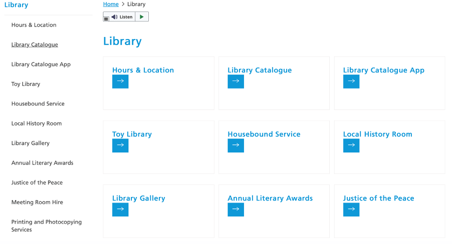
The website’s structure is a broad and shallow hierarchical structure and the organisation scheme is a topical scheme. The homepage is simple with blue and white colours. There could be more contrast with the font colour being a darker blue. This would be better for visibility, although it is still of an acceptable standard. There is a navigation menu on the left hand side and main page have the same options displayed in large buttons. The large buttons and fonts make it easier to access the website for users with low vision and also for people with fine motor skill issues.
There are 17 different menu options on the page. It would be more advisable to group some of the options together. It is suggested to have five to six main navigation items displayed as a maximum number (Gambrell, 2015). This is to ensure the users are not overwhelmed. It may also be useful to put easily recognisable icons for the menu options.
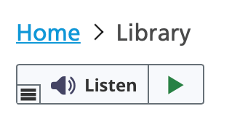
The website has a text to voice reader for the website. Which is great for people with poor or no vision. However, it was difficult to use on my laptop. I would probably have someone from IT look into it, to ensure that the software is working properly in general and is working on different devices, eg. Microsoft and Mac computers.
The navigation of the website is difficult with only the use of “Tab”, “Shift+Tab” and “Enter” keys on the keyboard. A mouse needs to be used for access to some parts of the website making it not completely user friendly for all. ‘People who use keyboard-only or voice-only will not be able to access parts of the website that rely on a mouse click’ (Government of Western Australia, n.d.). It would be useful to have the website tested to see the ease of usability of the all the websites features and then to modify any required parts.
This website does not have an accessibility help menu which would be helpful to add. It would offer all ‘users the chance to view…pages through an entirely accessible lens’ (Sutton, 2017)’. Making the website a better experience for everyone.
References
Gambrell, K. (2015). 7 best practices for creating a user friendly library website. Retrieved from https://www.ebsco.com/blog/article/7-best-practices-for-creating-a-user-friendly-library-website
Government of Western Australia. (n.d.). Tips to make your website accessible. Retrieved from http://www.disability.wa.gov.au/Global/Publications/Understanding%20disability/Built%20environment/Accessible%20websites%20checklist.pdf
Sutton, H. (2017). Follow 5 steps to create elegant, accessible web design. Student Affairs Today, 20(2), 7. https://doi.org/10.1002/say.3033


Good evaluation. You have made good use of screenshots and the literature to support your discussion. I hope you found this useful activity.
LikeLike